Welcome to the new block editor. You are looking at a paragraph block. At the end of it there is a more block. If you’re reading this text from an archive you can see a link to read the full post following the paragraph. This one for example shows “Keep reading” but the default value is “Read more”. The text of the read more link can be customized from within the editor.

And this is an example of a quote block. In the new editor you can add citations to quotes which was not possible in the earlier editor. Pretty neat, huh?
Nobody, ever
Table of contents
And that was a heading block. What follows is a list block with links that point to anchors assigned to heading blocks.
- Image blocks
- Gallery blocks
- Video block
- Audio block
- Embed blocks
- Cover blocks
- Formatting blocks
- Dynamic content blocks
Image blocks
The Gutenberg editor introduces some new ways to display images. Here is for example an image block with full width alignment. When aligned full width the image will expand outside the content margins all the way to the edges of the screen. Useful for when you need to showcase an image with lots of detail.

You can format the content inline like with the classic editor and you also have a plethora of new block options to create richer content like ever before. Now you can add elements like buttons and tables and even separate the content into columns.
Of course it is still possible to align images the traditional way. Here is for example a left aligned image with a caption.
All children, except one, grow up. They soon know that they will grow up, and the way Wendy knew was this. One day when she was two years old she was playing in a garden, and she plucked another flower and ran with it to her mother. I suppose she must have looked rather delightful, for Mrs. Darling put her hand to her heart and cried, “Oh, why can’t you remain like this for ever!” This was all that passed between them on the subject, but henceforth Wendy knew that she must grow up. You always know after you are two. Two is the beginning of the end.
Pull quotes
Pull quotes have been a part of the print industry for a long time and now you can use them in your posts. Use them to emphasize an important piece of text in your content. You have several alignment options to choose from and you can even change their color and background, add borders or add citations.
“You’ve got to ask yourself one question: ‘Do I feel lucky?’ Well do ya, punk?”
Dirty Harry
You don’t have to align images all the way to the edges of the screen though. Use the wide width alignment to have an image expand just outside the content margins. A great way to emphasize important images.
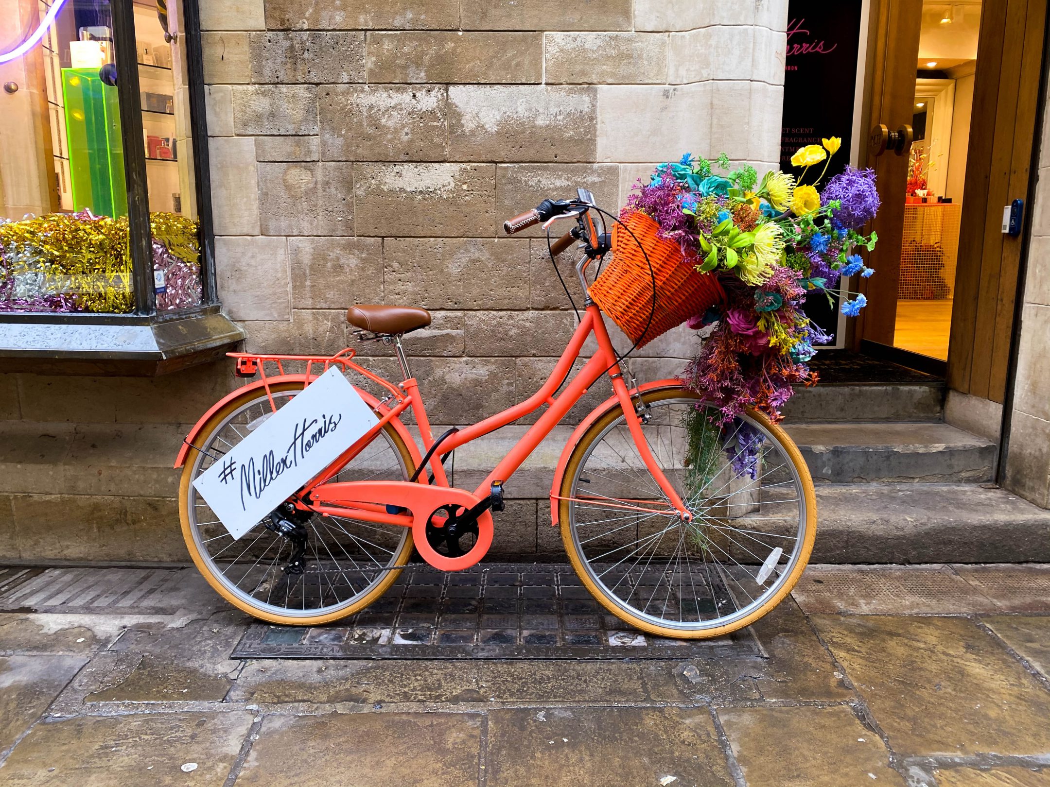
When aligned to the left or right, pull quotes will expand outside the content margins. This helps them stand out and attract your reader’s attention. It’s why they are called pull quotes after all.
Toto, I have a feeling we’re not in Kansas anymore.
We must be up inside the cyclone! Oh! Miss Gulch! Oh! Toto, I have a feeling we’re not in Kansas anymore. We must be over the rainbow! Now I know we’re not in Kansas. Are you a good witch or a bad witch? Why, I’m not a witch at all. I’m Dorothy Gale, from Kansas. Toto’s my dog. But l’ve already told you, I’m not a witch at all. Witches are old and ugly.
Gallery blocks
Items in the last row of gallery blocks whose items don’t divine in an even number by their columns expand to fill the entire available space giving you the ability to create beautiful grids.
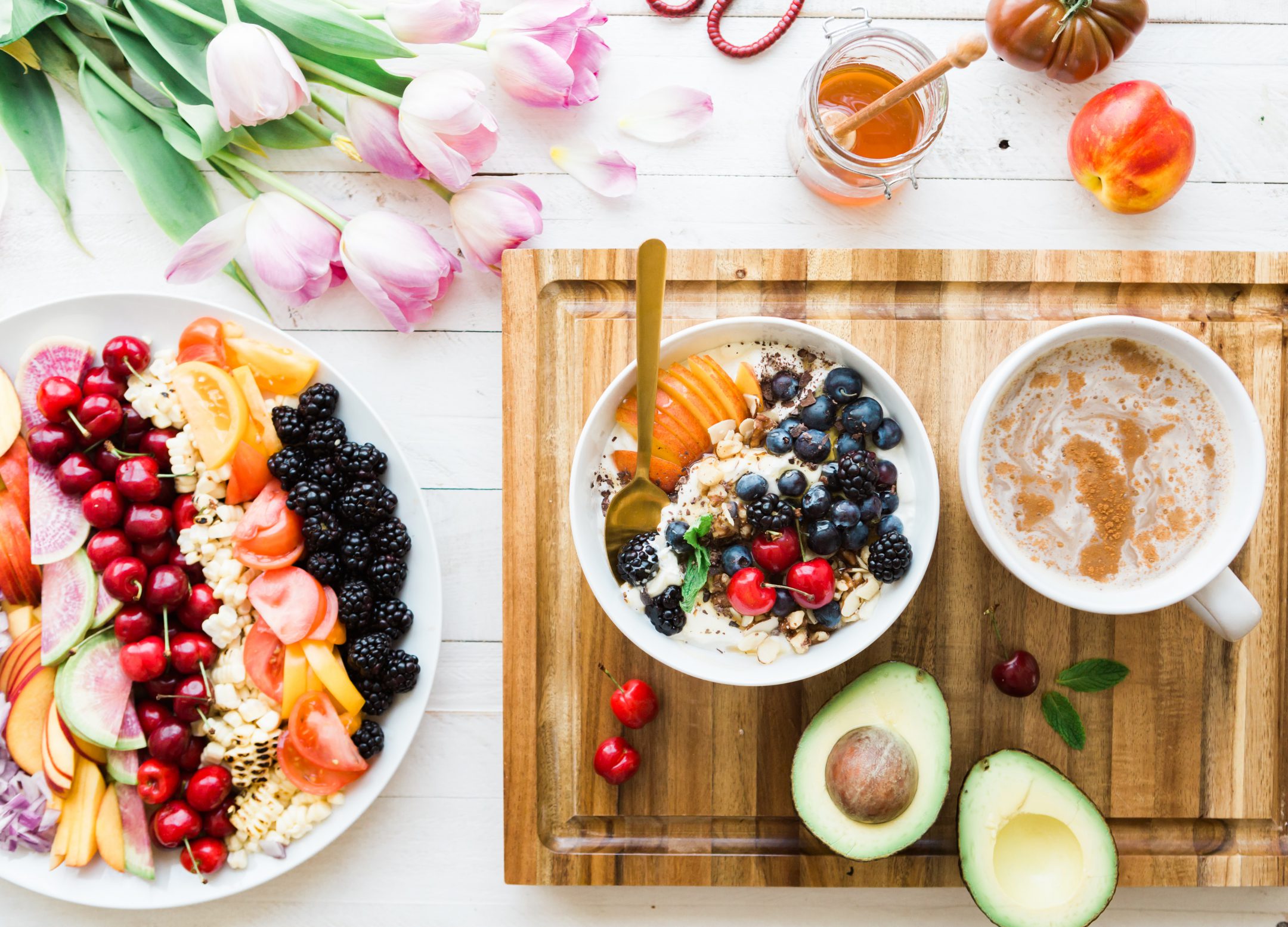


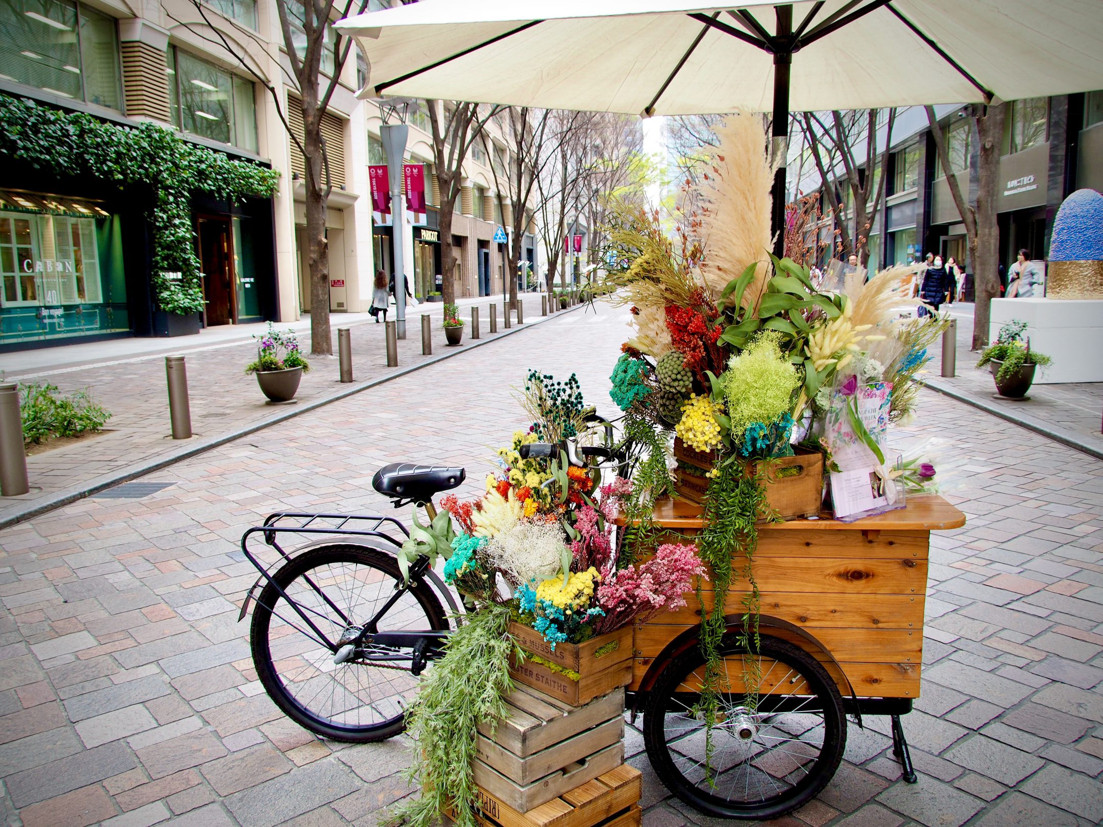
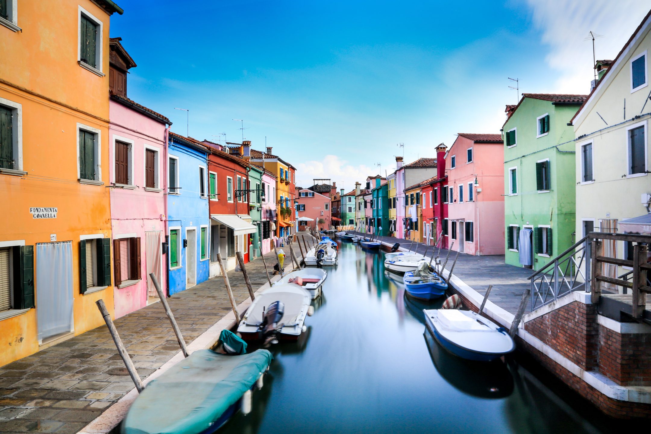
This example is wide aligned but you have multiple alignment options to choose from. We won’t show all of them here as to not bloat the page too much.
Separator blocks
Use separators to indicate a thematic change in content. Here’s the standard separator block which displays a horizontal rule.
You have more options to choose from though. Here is the same block displaying dots instead of a line.
You can also display a wider and thinner horizontal like.
And that’s about it when it comes to separators.
Cover blocks
The Cover block displays text overlaid on an image used as background. It is quite a versatile block and can be used in many creative ways.

All roads lead somewhere.
The above is the default way that the cover block looks like, with a dark overlay and large text. You can control most aspects of the cover block, however. Like for example the opacity of the overlay or the size of the text and even the focal point of the image or set the background as fixed.
Table blocks
Tables have several options you can choose from but the most important are the simple and striped styles. Below is an example of the simple style which is also the default one.
| Level | Description | Skills |
|---|---|---|
| A1 | Beginner | Basic vocabulary and grammar |
| A2 | Elementary | Basic listening and understanding |
| B1 | Intermediate | Can carry simple conversations |
| B2 | Advanced | Can carry complex conversations |
| C1 | Proficient | Can carry technical conversations |
The striped style alternated rows making it easier to follow the flow of the content.
| Level | Description | Skills |
|---|---|---|
| A1 | Beginner | Basic vocabulary and grammar |
| A2 | Elementary | Basic listening and understanding |
| B1 | Intermediate | Can carry simple conversations |
| B2 | Advanced | Can carry complex conversations |
| C1 | Proficient | Can carry technical conversations |
You can also assign backgrounds or make all columns of equal width. We won’t be showing all possible examples here to keep this demo concise.
When the cover block is aligned full-width and full-height, the background is set to fixed and the content aligned to bottom the theme adds a scroll effect to the cover block creating an immersive reading experience. It works best with large chunks of text that are longer than the viewport of the screen and since you can separate the text into paragraphs you can fit an entire chapter in a cover block. Below some filler text to demonstrate the feature.
All children, except one, grow up. They soon know that they will grow up, and the way Wendy knew was this. One day when she was two years old she was playing in a garden, and she plucked another flower and ran with it to her mother. I suppose she must have looked rather delightful, for Mrs. Darling put her hand to her heart and cried, “Oh, why can’t you remain like this for ever!” This was all that passed between them on the subject, but henceforth Wendy knew that she must grow up. You always know after you are two. Two is the beginning of the end.
Of course they lived at 14 [their house number on their street], and until Wendy came her mother was the chief one. She was a lovely lady, with a romantic mind and such a sweet mocking mouth. Her romantic mind was like the tiny boxes, one within the other, that come from the puzzling East, however many you discover there is always one more; and her sweet mocking mouth had one kiss on it that Wendy could never get, though there it was, perfectly conspicuous in the right-hand corner.
The way Mr. Darling won her was this: the many gentlemen who had been boys when she was a girl discovered simultaneously that they loved her, and they all ran to her house to propose to her except Mr. Darling, who took a cab and nipped in first, and so he got her. He got all of her, except the innermost box and the kiss. He never knew about the box, and in time he gave up trying for the kiss. Wendy thought Napoleon could have got it, but I can picture him trying, and then going off in a passion, slamming the door.
Mr. Darling used to boast to Wendy that her mother not only loved him but respected him. He was one of those deep ones who know about stocks and shares. Of course no one really knows, but he quite seemed to know, and he often said stocks were up and shares were down in a way that would have made any woman respect him.
Buttons blocks
Here are some buttons in different styles.
You can pick from solid or outline style and customize the button’s color, background and border radius.
There is also a file block where you can add a button to download the file.
Next to the button the name of the file will be displayed (which can be customized from the editor) as well as an icon indicating the file’s type.
Video blocks
You can self-host videos and display them on your website. The video block works similar to the old video shortcode but offering many more possibilities like choosing which controls to display and adding captions.
Of course you are not limited to self-hosted videos. Here is an example of an embedded Youtube video. You can even align videos and embeds wide or full width. How cool is that?
Speaking of embeds…
Embed blocks
With the new editor you can embed pretty much anything. Here is a Spotify playlist for example.
Some popular services like Facebook and Instagram don’t work out of the box but fortunately the Jetpack plugin has you covered. See the Jetback blocks post for examples.
Columns block
Here’s some text spread over two columns. You can nest additional blocks inside the columns. Here’s an image block.

On mobile devices the columns stack on top of each other.
If you’re reading this from your phone you should see it below the previous content, otherwise you should see it next to it.
You can pick the number of columns and even customize their width and change their alignment, including their vertical alignment.
Overall the columns block is pretty versatile, allowing you to build advanced layouts. The theme integrates Bootstrap’s grid system with the columns block to make it look consistent with the rest of the theme’s design language.
Audio blocks
You can also add audio tracks. Useful for example for podcasts or audio transcriptions for your posts.
And of course you can also embed music from popular websites. Here is a song from SoundCloud.
Media & Text block
The Media & Text block, as the name implies, allows you to display text next to a media item like an image or video. Useful for when you need to convey more information than fits in a typical caption.
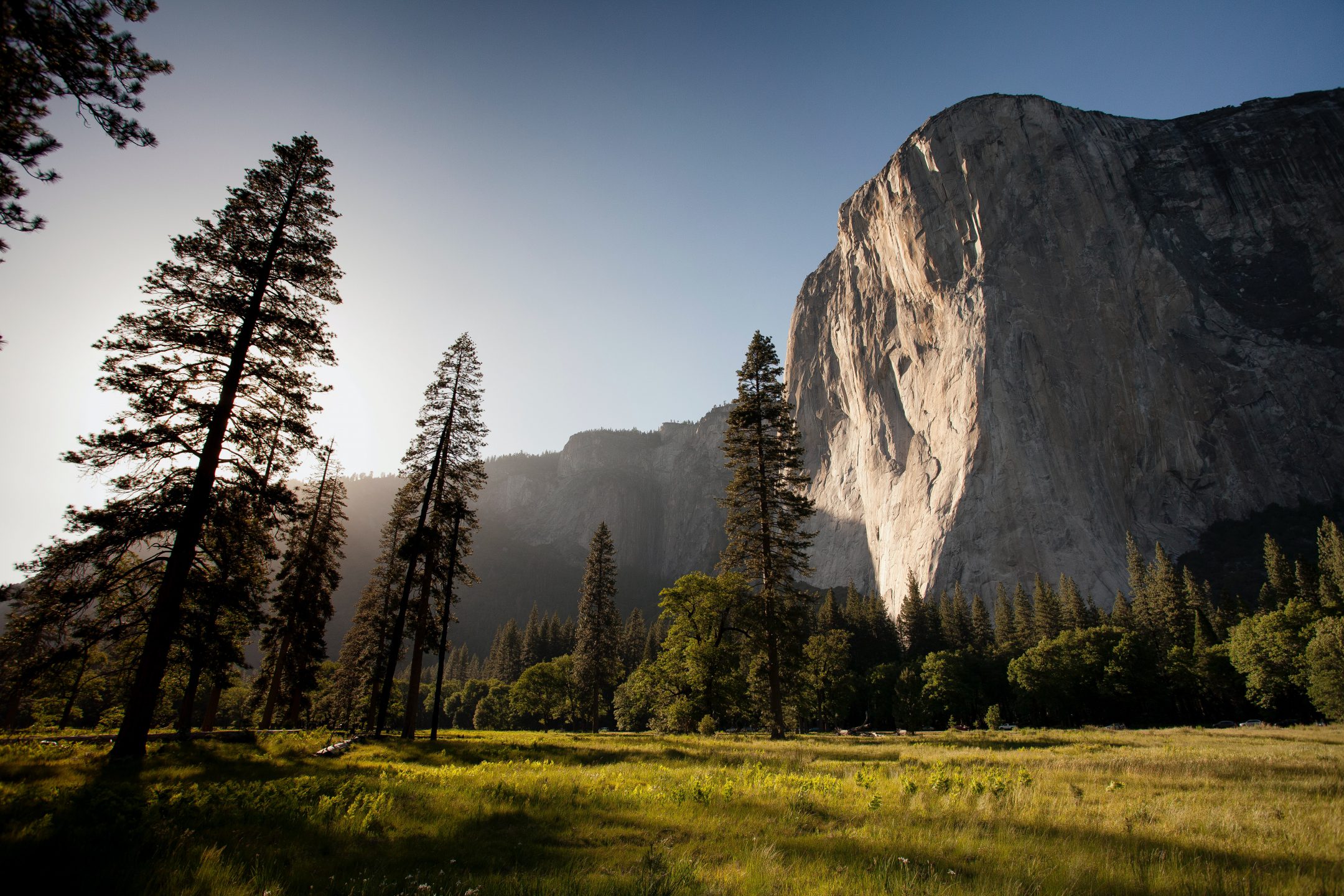
Yosemite National Park is located in the Sierra Nevada mountains in California. It is known for its ancient sequoia trees and the El Capitan rock formation is probably its most famous landmark. With a height of about 3,000 feet or 914 meters from its base to the summit it is a popular choice for rock climbers. The top of El Capitan can be reached by hiking out of Yosemite Valley on the trail next to Yosemite Falls, then proceeding west.
The Media & Text block is wide aligned by default as shown above. The image can be aligned either left or right and you can customize the block’s vertical alignment and choose whether to stack the columns on mobile or not.
Latest posts block
The “Latest posts” block like the recent posts widget displays the latest posts from your blog but offers additional useful options like displaying the date, author, featured image and summary. Additionally, it allows you to filter posts by author and category and also allows you to change the posts’ order.
The theme styles this blog as a simple list when the options are set to display only the post’s title, which is the default behavior, and as a rich widget when it is set to display other options. Useful for when you want to create a custom front page for your website, like a magazine cover.
Code blocks
Use the code or preformatted blocks to show bits of code.
<?php
function print_hello_world() {
	echo 'Hello World';
	return true;
}
The code or preformatted blocks look and feel almost identical, the only perceivable difference being that with the code block you can use tabs indentation, while with the preformatted block you can not.
<?php
echo 'Hello World';
die();
Verse block
The verse block is intended for writing poetry. It’s especially useful for short poetry such as haikus.
A block for haiku?
Why not?
Blocks for all the things!


